An Introduction to Simple Things
I stopped writing half-way through to think about the tone of the article and what I wanted to get across. I also had to take a moment to think about who I was writing this for. Would it be for myself to vent? For other designers and programmers to sympathize? Or for clients who would like to know the best way to work with designers and programmers?
As always, given my affinity towards education, I chose to the last option. This article may sound harsh at times but understand that I am trying to create an appreciation for the underlying work involved in making something “simple”.
“Simple” vs “Simple”
It’s a pet peeve of mine when clients tell me “just make it simple”. It’s annoying because, in their minds, “simple” equals “cheap” because “simple” is “less work”.
It is not.
Something that is “simple” for a user is the most sophisticated thing to build and implement. The more “simple” something is, the more thought has been put into it. When something is “simple” it should be intuitive, clean, beautiful in it’s simplicity and that comes with work.
Simple "design"
When I meet with clients and ask them for design notes and they say “idk, just something simple”, I know I’m in for a long meeting.
That statement tells me a few things:
- They have not taken the time to reflect on their own brand
- They probably think that design work is “easy”
- They are expecting me and my team to come up with ideas that they can pick and choose from and critique
There is nothing wrong with this. Our clients come to us because we are a full-service digital agency and we are expected to guide them through this process.
As long as clients understand that there is work involved and they are willing to pay us for our mental efforts, this is not a problem. In fact, it is one of my favorite exercises when consulting with a client.
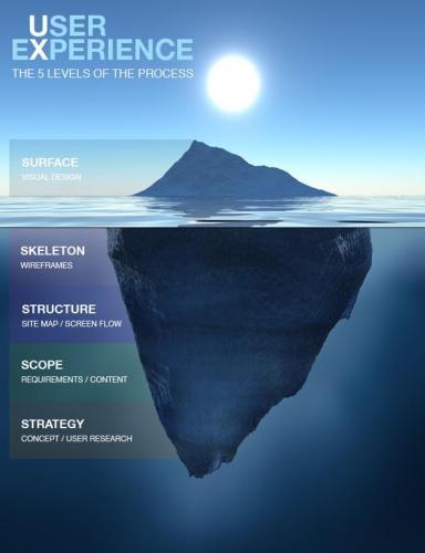
The old analogy, when it comes to design and technical work, is that it’s like staring at an iceberg from the deck of a ship. You see a small portion of the ice poking out from the top of the water and underestimate the full size of the structure that’s hidden below the surface.

Clients are only interested in the final product and don’t always understand the work behind what’s presented. What’s important to understand is that if three designs are presented (for example), these three designs are:
- The culmination of a career’s worth of experience
- The culmination of hours of work on their specific project
- A thought out sampling of the best variations after a long design process
- The finished, polished, edited version of each version with a particular reason behind its careful selection
The presentation of these designs should be simple in the sense that the presentation should not be cluttered with other ideas. The viewing process should be free of distractions or “noise”. Each design should be given the time and space to stand on their own and be appreciated before moving on to the next item.
But this is not easy to achieve. You need to give the viewer a chance to take in the design as an almost finished product. Then, you need to break each design down to its components and explain the design choices clearly. The design needs to be placed in the larger context of the other aspects of the project (such as marketing, or in different scenarios, placed on different mediums).
The Futur did an excellent video on how to present logos. It’s a 24 minute video. Let that sink in for a moment.
Someone explaining how to present a logo takes 24 minutes. How long does it take to actually implement the recommendations in their video for the presentation? Not to mention the time it takes to create the design itself. This attention to detail is what separates an agency from most freelancers.
Appreciating how “simple” a design is will go a long way when collaborating with creative and technical people. Showing an understanding and respect for the work put into a design is always well received even if you don’t fully understand all of the work that went into a project. It’s also painfully obvious when the time and thought has not been put into the project even if you can’t put your finger on what the exact issue is.
"Simple" Functionality
As the technical lead at Drive, this is the part that I usually have to explain. I get away with having a solid product and years of automation under my belt to help me cut corners work-wise but this sometimes just makes things worse.
Similar to design, functionality is something that people have taken for granted in our modern, tech-laced, world. I don’t blame people for this and often have to explain to my own team the nuances of making some of our in-house tech work the way they want.
The classic example I always like to use to explain my point is Siri. From a user perspective, Siri is extremely “simple” to use. You tell her something and she responds. Ask most people how Siri works and they have no clue.
Under the hood there are layers of audio sensors, machine learning, search algorithms, and big data driving the whole thing. When you understand some of the layers and the decades of work going into these fields, you gain a new appreciation for the tip of the iceberg that is Siri.
The same goes for any dozens of interfaces you use on a daily (or hourly) basis. Every pixel that you see required some unknown mountain of thought put into it. When you use the Gmail App on an iPhone, some poor soul sitting at a desk at Kitchener-Waterloo had to make sure the app is always “pixel-perfect”.
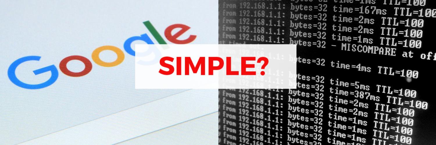
When you ask me to “make something simple”, that can mean one of two things: spend ungodly amounts of time, money, and human resources in the form of thought equity; or spend two minutes to script a thing that runs once under ideal conditions.
One gets you an intuitive user interface, the other gets you a command to run on an SSH command line. Which one do you need? Which one do you mean?
Take Away
I once had a guy ask me to “make it simple, like Facebook”. I had to explain to him that Facebook was a multi-billion dollar company with countless engineers making $100k USD a year. If he had a couple million dollars, I can bootstrap something for him. He promptly changed his mind and asked for “something simple then, like Gmail”. I had to explain to him what Google was ….
Just don’t be that guy. I never ended up working with him because every conversation was the same. I was always polite and gave him a realistic budget and, over time, he stopped calling for “quick quotes”. He could not afford “simple”.
Don’t say “simple”, say what you mean. Explain your vision and have a healthy appreciation for the work underneath the hood to create the asset. Respect your creative and technical teams and you will reap the benefits of having a motivated, engaging, enthusiastic team working with you.
In other words, appreciate what “simple” really means.


