Minimalism is so pervasive in web design that it’s almost considered “status quo”, so it should come as no surprise that it has inspired an edgy counter-movement, aptly calling itself Maximalism. While it’s easy to write off as a passing fad rather than an emerging trend, there are 3 things you need to know about Maximalism before deciding to forget it ever existed:
1) It’s already popular in Japan.
2) It’s ugly as sin (on purpose).
3) It’s not for everyone.
Stop, Break It Down: Minimalism
Before we can pick apart the good, the bad, and the (objectively) ugly sides of Maximalism, it’s important to understand the opposing theory that inspired it. A counter-cultural movement isn’t born in a vacuum! Maximalism is a direct rejection of the “restrictive” barebones philosophy of Minimalism. When Less Is More just isn’t enough anymore.
Ironically, Minimalism was once itself considered a rejection of Abstract Expressionism in the contemporary art world, proving once again that history is bound to repeat itself and every generation of rebels trying to break the mold will inevitably miss the irony. Nevertheless, the concept of stripping away unnecessary elements in a composition is a multidisciplinary idea, transcending all manner of media and art forms, both online and off.
Minimalism In Web Design
Minimalism is all about breaking down a concept to its simplest form, whether in art, architecture, or design. Eliminating superfluous elements is considered such a pillar of design basics that it’s almost synonymous with “good” design. It’s clean. It’s modern. It’s chic. What more do you need?
In website design, minimalist principles have manifested in trends such as:
· Flat patterns and textures
· Limited colour palette
· Restricted interface elements
· Maximized negative space
· Prominent typography
· Hidden global navigation
· Large background images
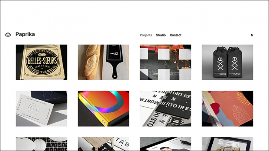
· Organized visuals (grid gallery
Japanese Minimalism: Ancient Zen
Minimalistic design as an ideology has been heavily influenced by Japanese traditions, including Zen Philosophy, and the aesthetic principles of Ma (empty / open spaces), and Wabi-Sabi (plain / simple objects). Even the balanced simplicity of the Japanese flag echoes a modern minimalist aesthetic.
Zen Philosophy believes simplicity as having not only inherent visual appeal, but also moral value as it provides insight into the true nature of an object, revealing its essence or inner qualities. The Japanese art of floral arrangements known as Ikebana conveys this idea, while humble Hagi pottery tradition represents Wabi-Sabi ideals.
One of the Universal Principles of Design that help us understand minimalism is horror vacui – a latin expression meaning “fear of emptiness”, or in design terms “fear of white space”. It’s the antithesis to the concept of Ma, which embraces the purity of the “void” — because when there is too much, nothing stands out.
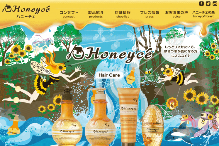
Japanese Maximalism In Web Design
-
The Japanese are no strangers to espousing minimalist concepts beyond fine arts, as part of everyday life. Marie Kondo famously taps into the core values of this movement with The Life-Changing Magic of Tidying Up. Buddhist rock gardens, succinct Haiku poetry, austere tea ceremonies, and many other ancient traditions all resonate with the same Zen ideals of purity, modesty, and simplicity.
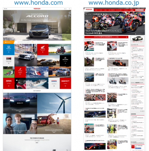
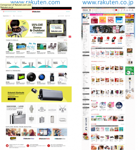
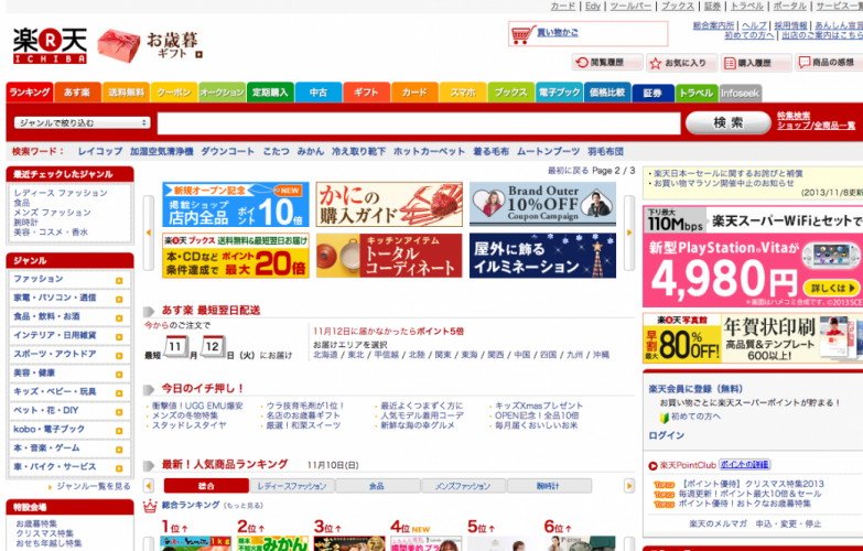
So why is it that in the world of web design, the Japanese have a distinct preference for the extreme polar opposite aesthetic? If you look at the .co.jp equivalent of any .com website for a major global corporate brand, you’ll notice the difference right away. Horror vacui!
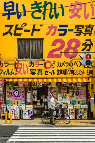
The typical layout for any Japanese website, even those of high-end brands that can afford expert local marketing agencies, is an overcrowded hot mess of content crammed into every inch of available space. Some of the most popular sites in the country make the same design choices:
· Densely crowded text
· Tiny low-resolution images
· Excessive amounts of columns
· Extra bright, often clashing colours
· Distracting, flashing banners
- Outdated tech like Flash sites
These are not only stylistic choices that Japanese consumers recognize and prefer, but also a marketing-savvy decision that is crucial to gaining trust from this target audience.
Why So Cluttered?
These sites would be completely off-putting to Western eyes, so why do they have a different effect on Japanese web users? There are a number of theories behind what makes this type of “maximalism” the popular choice in the Land of the Rising Sun, including:
Language-based differences:
- Asian characters can look cluttered and cramped compared to the Latin alphabet, but foreigners are simply not used to processing large amounts of data in a small amount of space. Language has profound influences on psychology, and the inherent density of logographic-based languages teaches a culture to be more comfortable with scanning text quickly and efficiently for information.
- Western languages rely on visual cues for stating emphasis, including capitalization, italicization, and expressive punctuation. These tools provide clear structure and hierarchy at a glance, while logographic languages must rely on superfluous decorative elements to achieve similar contrasts for organizing information, which can easily lead to cluttered chaos.
- While Japan has no shortage of cutting-edge technology, most of the programming languages that drive advances in web development were designed in English. Even a short-lived temporary language barrier from software translation delays has long-term effects on the rate of adoption of emerging online trends.
Culture-based differences:
- Japanese culture encourages both risk avoidance and blending in, so once any consensus for status quo has been established (even within its “nonconformist” subcultures) everyone is expected to follow suit. Despite improved solutions becoming available in many areas of technology, the Japanese still prefer paper money over credits cards and websites that look like they’re stuck in the nineties.
- As part of their risk avoidance norms, the Japanese consumer aims to be as informed as humanly possible about every purchasing decision. This is why it’s common to see plastic meal replicas outside restaurant windows, and why advertising of any kind is expected to provide a laundry list of features and technical details on their products up front. If such information is not readily and proudly on display, companies risk arousing suspicion from its hyper-discerning customer base.
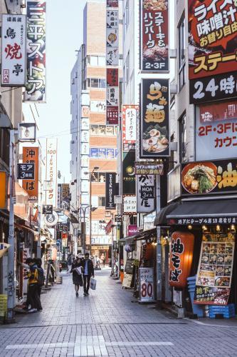
- Just as language can influence psychology, so can physical space – and for most of Japanese commercial centers, space comes at a premium. The population density that inspired capsule hotels and a lucrative vending machine industry (these more cost-efficient than regular hotels and classic storefronts) also inspired the tightly packed advertising aesthetics of the Japanese urban landscape. Just as no inch of space is wasted in main hubs like Tokyo’s Shibuya district, the same principles apply to negative space on chirashi flyers, newspapers, and webpages.
Western Maximalism
As fascinating as the oxymoronic influences of Japanese culture on both Minimalism and Maximalism aesthetics may be, why should we care unless we’re doing business out East?
I’ve got news for you – Maximalism has hit the West. It’s currently being touted as the “hot” new web design trend of 2018, but the reasons for its popularity here are VASTLY different from those that have made it a staple of Japanese web design for so many years.
And that’s important to know, or else you might rush to hop on this bandwagon, thinking it’s a cutting-edge trends where the Japanese are early adopters – when really they’ve been living in the web design stone ages this whole time. It seems online advertisers just decided to hop a time machine this year because we’re taking this 90s fashion renaissance period way too seriously.
So no, you’re not wrong for thinking Maximalism is ugly. In fact, that’s mostly the point. Its defining cluttered chaos is still quite jarring to our Western sensibilities, so it’s not our tastes that have suddenly changed. It’s our mindset.
Just like wearing an ugly Christmas sweater “ironically” may be seen as an anti-fashion statement, using a Maximalist design style is the ultimate expression of anti-design. It’s a punk move.

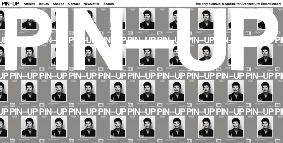
Maximalism In Web Design
Maximalism was already making big waves in fashion and interior design, but in the context of web design it manifests as a slightly different beast. If the point of Minimalism in web design is simplicity, readability, and usability, then the point of Maximalism is extravagance, excess, and chaos.
“If it hurts your eyes, it’s probably maximalism. Or a solar eclipse”
- Mariah Driver, Content Producer at WebFlow
Maximalism can be considered an offshoot of Brutalist website design, which is characterized by the “raw” early Internet aesthetics of websites like Angelfire and Geocities. In other words, purposely dated with minimal concern for a user-friendly experience.
Some newly established “hallmarks” of Western Maximalist web design include:
· Repetition of words/images as a “mesmerizing effect” (think YTMND sites)
· LOUD colors (highlighter rainbow neon and fire-engine reds)
· Confusing, unintuitive navigation system
· Flashing or distracting visual / audio elements
· Clashing layers of elements competing for visual hierarchy
· Brutalist callbacks like uderlined hyperlinks, typewriter fonts, and other early web tropes
As the name suggests, MAXismalism invites extremes. Its philosophy is redundancy: More is more.
Some would argue that making the audience work harder to get any use out of the site makes for a more “immersive” experience, and that adopting a purposefully jarring aesthetic also makes it more memorable. However, these kind of design decisions are not to be taken lightly. Remember your audience!
Minimalism Vs. Maximalism: UX Concerns
Western Maximalism has already distinguished itself from its Japanese counterpart by taking its chaos to the next level. However, with Japanese sites there appears to be a stable audience base that’s already set in its ways, whereas the future of Western Maximalism may quickly die off or evolve once its shock-value novelty wears off.
If you’re aiming to tap into your end users’ nostalgia for the early days of the Internet, or looking to impress a tech-savvy, artistic audience that can appreciate the anti-establishment statement of a purposely ugly website, then there may be something to gain from this fad. But if anyone mistakes your site’s “ironic” glitches for real, hack web development, you may just risk rubbing your audience the wrong way.
Fads Vs. Trends
You might remember the grunge / high-textured aesthetic fad that had graphic designers everywhere digitally hoarding every hi-res photo of brick walls and paint splatters they could get their hands on. Yet that look is no longer “in”. What made it a fad instead of a lasting trend?
Whenever a new popular style gains steam in any realm, from fashion to advertising, everyone rushes to ride the wave. It’s important to risk the temptation of going after a “cool” new craze if it doesn’t align with your branding, otherwise you risk giving the exact opposite impression.
Plus, the more popular the fad, the more likely you’ll fail to stand out, even negatively, when so many people are attempting to do the same. Instead, you’ll just blend in with everyone else who shared in the collective, short-lived enthusiasm.

Timeless Design
Before you get too excited about the latest “hot new trend” in web design, consider whether the decision to adopt it will serve your brand’s communication, or just add noise. At the end of the day, make sure that your website always represents your brand with authenticity, and delivers the experience you want visitors to have.